
I've finished up a new story featuring Alan (the main character from "Moving In, Moving On") called "The Language of Ice Cubes", so I'm going to need an ebook cover. Here's how I do it.
First, I find an appropriate picture. In this story, there's a ghost palm tree so I grab the nearest picture of a palm tree I've taken. I make sure there's a big blank space for the title and author name, but you knew that.
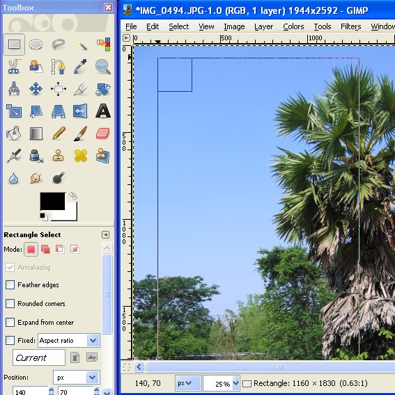
Then I open up GIMP (it's free!) and drag and drop in the picture. Right now it's too big. We're shooting for 500x800, which is 0.63:1. I'm going to choose an exciting portion of the picture that has enough space for the title and author name.
To save a lot of fiddling and annoyance, check on Snap to Grid (View --> Snap to Grid) first. Then find the Rectangle Select tool and click and drag until you've got a good-looking 0.63:1 rectangle, like so:
 |
| Rectangle Select |
Second step is to get ourselves a new image. Do this:
Edit --> Paste as --> New Image
You should now have an image of the selection, so save this new image (you can close the old image to reduce clutter). Now, this new image is probably not 500x800, but that's easy enough.
Go to
Image --> Scale Image
and input Width 500 and Height 800 and behold!
| Blank |
 |
| Text |
 |
| .xcf |
File --> Save as...
and replace the .xcf with .jpg and save (see below)
There, that was easy! Anybody can do it.
Or you can give me $50 and a picture and I'll do it for you.

"The Language of Ice Cubes", magical realism with a dash of romance.
Alan just wanted something to do, but he soon discovers that maintaining a relationship in small-town Thailand is a more challenging proposition than he expected. Can he (and she) find a way through to happiness?
----
250 words? Yes
Book "Lived Too Long To Die"
- - - -
Reading - ?
*102
This is a great post! I've used PowerPoint on the last six or seven ebook covers (for short stories), and it's worked fine. (They'll slowly be released as I hear back from whatever magazine they're at.)
ReplyDeleteBut there's no color contrast analyzer with PowerPoint.
I think I need to check out GIMP.
I downloaded GIMP recently, stared at the shell, and then didn't do anything with it. But now, I can make e-book covers!
ReplyDeleteThe thing I really want to learn is how to make some kind of diffuse glow appear around the opening of a vault door in a stock photo I picked up. Can you teach me how to do that? Or do I have to drop the George Washingtons?
Nice.
ReplyDeleteGlad you like it, folk!
ReplyDeleteJeff, that Color Contrast Analyzer can be used with anything. It's just more convenient to get the number codes from images in Photoshop/GIMP (using the Eyedropper tool) than in Powerpoint.
Ben: This post is a snapshot of what I would be able to teach with confidence. As I mess around with Filters and the Tools until something works, I'll document it. But there are much better resources for fancy stuff. Just very few for absolute basics like this, hence the post.
ReplyDeleteCharlie: Yeah, this is the high water mark for the blog before it derails.
ReplyDeleteRight now I don't need anything fancy, just a decent image, a big title and an author name. As I get better, I can always change the ebook cover art anyways. My "fanciest" cover thus far is for Preemptive Mercy, where I played with the Colors tab too. Just because most of my pictures are taken during the day and the story is not a daytime story.
Very good post. Thank you :)
ReplyDeleteI've been using both Gimp and Inkscape for covers.
ReplyDeleteTo make your photo "pop" more .. go to menu/colors/levels and then use the three droppers to pick the black, gray, and white points in your picture. Then move the slider in the center left and right until you get a brighter and more dramatic picture. Sometimes it doesn't take much to make a huge improvement in the image.
Inkscape allows some additional options, specifically the vector lettering that resizes smoothly plus an ability to trace sketches and make them transparent so you can colorize an ink drawing for example.
That's a great tip, now I've gone and tried it. Thanks!
ReplyDelete